go back to Introduction to R data structures
Where do I go from here?
If you have completed all of the earlier lessons, you should now have the background to get started using R to solve practical problems. There are many ways to use R, so the information below introduces only a subset of the most common topics: data wrangling, data visualization, and statistical analysis. These topics aren’t independent - data wrangling is often necessary before statistical analysis or data visualization, and data visualization (data “viz”) and statistics often go hand-in-hand when trying to make sense of a data set.
Data wrangling with R
Data wrangling (sometimes also known as data munging) refers to many possible processes that can be used to turn the data that you have into the form necessary to do what you want. That can include extracting data from a raw source, cleaning the data, extracting a subset of the data, transforming the data, merging several datasets, and preparing data for archiving.
This is clearly a huge topic, so this will just provide several starting points.
Tidy data
The buzzword “tidy” data was coined by Hadley Wickham and is described a a paper called Tidy Data in the Journal of Statistical Software 59(10). The basic idea of Tidy Data can be summaried in four points:
- Each type of observational unit forms a table
- Each variable forms a column
- Each observation forms a row
- Each value must have its own cell
These principles aren’t exactly new, but Wickam should get credit for formalizing the idea of Tidy Data and writing R libraries that help tidy up data.
Often messy (“untidy”) data is in a more compact form. Here’s the typical way one might organize height data in an Excel spreadsheet:

However, these data aren’t “tidy” because each observation isn’t in its own row, and the independent variable factor values (male vs. female) aren’t in a single column. In contrast, the data in this form (using grouping variables):

is “tidy” because the height observations are all in separate rows and the gender variable (male vs. female) is in a single column. Many statistical tests in R (e.g. t-test of means and various forms of general linear models; GLM) require data to be in this format.
The R package tidyr contains functions that can be used to transform the format of data from messy to “tidy”. For more information, see the chapter on “Tidy Data with tidyr” in R for Data Science, and the Software Carpentry lesson on tidyr.
Transforming data
The R package dplyr contains functions that make it easy to manipulate data in data frames. Manipulations include filtering, re-ordering, summarizing, and creating new variables from existing ones. For more on the dplyr package, see the chapter on “Data Transformation with dplyr” in R for Data Science, the Software Carpentry lesson on dplyr, and the RStudio cheat sheet on dplyr.
Splitting and combining data frames
The R package plyr contains functions for splitting and combining data frames. For more on the plyr package, see the Software Carpentry lesson on plyr.
Creating and documenting data pipelines
If you have a consistent data source that requires wrangling the data by processing it with a fixed sequence of operations, you can use R to create a data pipeline where the output of one processing step feeds as input into the next processing step. You can do this by simply creating an R script with the necessary steps, but there are two useful tools that allow you to document the steps in the same file from which you run the script.
Jupyter notebook Jupyter notebooks is a system where you can create code blocks that are documented with text and diagrams that explain what happens in each step of the process. The code blocks can be executed one at a time and display intermediate results so that you can know that the processing is going as expected. Jupyter notebooks can be installed separately, but are installed automatically as part of the Anaconda package.
R Markdown R Markdown is an extension of the well-known text markup language called Markdown. (See this Markdown cheatsheet for a quickstart. So R Markdown can be rendered by any application that will display or process Markdown. For example, an R Markdown page uploaded to GitHub will render with the styling included in the Markdown and R Markdown documents can be rendered as PDFs with an application like Pandoc. However, an R Markdown script will also execute as code within RStudio.
The actual R code is designated within the R Markdown using the usual triple backtick (```) method for displaying any kind of code block in Markdown. However, when loaded into RStudio, the R code blocks (known as chunks) can be run by clicking on the “play” button associated with each code block. There is also an option to include the output (results) when rendering the document. For more on R Markdown, see the “R Markdown” chapter in R for Data Science.
Data visualization with R
Graphics are a key part of R. There are several powerful packages that provide functions to create plots within R.
Standard graphics
The graphics package is included in the standard distribution, so many kinds of plots can be generated without installing any additional packages. A standard reference book for R graphics is R Graphics by Paul Murrel (now in its third edition). The book is available in print from online sellers, but some parts of older editions are available online, such as chapters 1, 4, and 5 of the first edition. There are also graph galleries for the figures in each chapter of the book that provide the code used to generate the plots.
Another more brief reference is Chapter 10 of R Cookbook by Paul Teetor (print book), which shows how to generate many of the typical kinds of simple plots useful to R users.
Grammar of Graphics (ggplot)
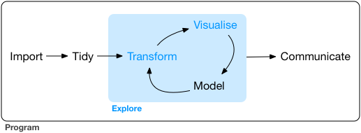
Data visualization can be considered part of a larger process of data exploration that also includes data transformation and modeling. Since the process is iterative, being able to adjust the way that the data are visualized as the exploration progresses is important.
The “grammar of graphics” is a philosophical outlook on graphics introduced in 2010 by Hadley Wickham in his paper A Layered Grammar of Graphics. The systematic layered grammar of graphics allows the visualizer to control features of the plot such as the geometry of the plot (line, box, dot, etc.), the asthetics (marker type, color, etc.), and statistical transformation of the data (such as smoothing) in order to make features or characteristics of the data more apparent. As the data exploration goes forward, based on what is learned the layered features can be adjusted to change how the data are displayed.
The ggplot2 package is based on the Grammar of Graphics philosophy and is described in the “Data Visualization” chapter of R for Data Science. For a high-level summary of ggplot, with pictures and examples, see the Statistical Computing Service short cours by Michael Friendly. To get an high-altitude overview of how the syntax of the ggplot function affects the features of a plot, see the Data Visualization with ggplot2 Cheat Sheet found on the RStudio Cheatsheats web page. For a cookbook approach, see the R Graphics Cookbook by Winston Chang.
ggplot itself can serve as the basis for more powerful visualization that are built upon it. Tree diagrams (e.g. phylogenetic trees) and ordination plots are two examples.
Statistical Analysis with R
There are many good resources available for learning how to carry out statistical tests using R.
If you are already familiar with basic statistical tests and want a jump start to doing those tests using R, Basic Statistical Analysis Using the R Statistical Package by Heeren and Milton of the Boston University School of Public Health is a good place to start.
An R Companion for the Handbook of Biological Statistics is the code supplement for the online Handbook of Biological Statistics by John H. McDonald. An advantage of this resource is that the accompanying text is available full text online. The examples include many of the most common parametric and non-parametric statistical tests, including some of the simpler multivariate tests.
R examples for The Analysis of Biological Data is a companion website for the very accessible Witlock and Schluter print text The Analysis of Biological Data. This book contains a lot of really fun and interesting examples.
The print book R Cookbook by Paul Teetor is a fairly comprehensive resource if you want straightforward examples of how to calculate a wide range of statistics and statistical tests. It includes random sampling and calculating probabilities (Chapter 8), calculating general statistics and comparisons (Chapter 9), linear regression and ANOVA (Chapter 11), principle components, bootstrapping, etc. (Chapter 13), and time series analysis (Chapter 14).
To try out some simple R scripts for t-test of means, paired t-test, chi-squared goodness of fit, chi-squared contingency, regression, and ANOVA, visit this page.
Revised 2019-09-08

Questions? Contact us
License: CC BY 4.0.
Credit: "Vanderbilt Libraries Digital Lab - www.library.vanderbilt.edu"