Previous lesson: Controlling the appearance of plots
R viz using ggplot: Statistical functions
ggplot allows you to used built-in statistical capabilities to explore your data without running separate statistical transformations. In this lesson, we will also see how some ggplot functions are actually built from less specific functions by assuming default values for some arguments.
Learning objectives At the end of this lesson, the learner will be able to:
- create a histogram using
geom_histand usebinsandbinwidthto control granularity. - plot multiple histograms on the same axes using a discontinous factor as the color aesthetic.
- create alternative views of data distribution using
geom_densityandgeom_qq. - view distribution summaries of multiple levels of a factor using
geom_boxplot,geom_violin, andgeom_dotplot. - describe how more specific types of plots are related to more general types.
- use an explicit
statargument to override the defaultstatfor a geom. - create error bars to illustrate the range of variation on a bar plot.
- use
geom_smoothto show the trend of scatterplot data. - control the type of curve fitting using the
methodandformulaarguments ofgeom_smooth. - turn standard error ranges on and off using the
seargument ofgeom_smooth.
Total video time: n/a
Links
real datasets to explore from “The Analysis of Biological Data” by Whitlock and Schluter
ggplot2 book - displaying distributions
ggplot2 book - explanation of components of a layer
Visualizing distributions
Histograms
bins and binwidth can be used to set the granularity of the bins used to block the data.
ggplot(usa_hemoglobin, aes(hemoglobin)) +
  geom_histogram(binwidth = 0.1)

ggplot(usa_hemoglobin, aes(hemoglobin)) +
  geom_histogram(bins = 50) # 30 bins is the default
If there are multiple levels of a factor in the data, each level can be plotted as a different histogram on the same axes using the color aesthetic:
ggplot(hemoglobin_frame, aes(hemoglobin)) +
  geom_histogram(aes(color = population), fill = "NA", binwidth = 0.5) # NA makes the bars transparent
For larger datasets where the data are smoothly distributed, a density plot may make more sense
ggplot(usa_hemoglobin, aes(hemoglobin)) +
  geom_density()
In this case, a density plot makes it much easier to visualize the overlapping distributions than the histogram. The alpha argument can be used to make the fill partially transparent.
ggplot(hemoglobin_frame, aes(hemoglobin)) +
  geom_density(alpha = 0.2, aes(fill = population, color = population))
A normal quantile (or “Q-Q”) plot makes the similarity and differences among overlapping distributions more apparent, although they are harder to understand.
ggplot(hemoglobin_frame, aes(sample = hemoglobin)) +
  geom_qq(aes(color = population)) +
  stat_qq_line(aes(color = population))
Box plots and variants for comparing distributions
Box plot
ggplot(hemoglobin_frame, aes(population, hemoglobin)) +
  geom_boxplot()
Violin plot
ggplot(hemoglobin_frame, aes(population, hemoglobin)) +
  geom_violin()
A dot plot shows the magnitude of the data throughout the distribution, but doesn’t work well for large datasets. It’s better for small datasets, including those that aren’t smoothly distributed.
ggplot(hemoglobin_frame, aes(x = population, y = hemoglobin)) +
  geom_dotplot(binaxis = "y", stackdir = "center", dotsize = .5, binwidth = .25, aes(color = population, fill = population))
In this example, the distributions are displayed vertically. Reversing the axes will display them horizontally.
Geom types and the stat argument
In the overall scheme of plot construction, there is a stage where statistics can be applied to data prior to plotting.
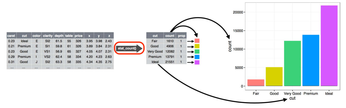
Figure from Wickham and Grolemund https://r4ds.had.co.nz/ CC BY-NC-ND
We’ll explore that stage in this section.
General and specific geoms
ggplot simplifies the specification of geoms by providing more specific “shortcut” geoms that don’t require you to specify all of the arguments.
The most general geom is layer, which can be used to build many different kings of geoms by specifying all of the details.
ggplot(erg_mean_frame, aes(x=color, y=mean_response)) +
  layer(
    mapping = NULL,
    data = NULL,
    geom = "bar",
    stat = "identity",
    position = "identity"
  )
The geom_bar geom is more specific by hard coding the geom to bar. This makes it easier to use because fewer arguments need to be provided. The following plot is exactly the same as the one above.
ggplot(erg_mean_frame, aes(x=color, y=mean_response)) +
  geom_bar(
    stat="identity"
  )
The stat argument specifies what kind of statistical transformation is done to the data prior to plotting. A value of “identity” tells the geom to use the data directly without any transformation.
The geom_col geom is identical to the geom_bar geom, except that the stat always defaults to “identity” and doesn’t need to be specified. The following plot will be exactly the same as the two above.
ggplot(erg_mean_frame, aes(x=color, y=mean_response)) +
  geom_col(
  )
The stat argument
A stat argument can be used to override the default stat for a geom. The default stat for geom_bar is “count”, but in this example, the y values are derived from a statistical summary of the data rather than the count of items.
ggplot(erg_frame, aes(x = color, y = response)) +
  geom_bar(stat = "summary", fun = "mean") # stat = "summary" overrides the default counting method
Error bars
Error bars are create using geom_errorbar. They can be applied as a layer on top of bar or point plots.
ggplot(graphing_data, aes(x=color, y=mean)) +
  geom_bar(stat="identity", aes(fill = color)) + # same as geom_col(aes(fill = color))
  geom_errorbar(aes(ymin = lower_cl, ymax = upper_cl),
                width=.2)
Statistically calculated line geoms
The geom_smooth geom will perform various types of statistical analyses on X-Y data to show the trend in the data. By default, the “loess” stat is used.
ggplot(lion_noses, mapping = aes(x = proportionBlack, y = ageInYears)) +
  geom_point() +
  geom_smooth()
By default, standard error ranges are shown around the trend curve. They can be suppressed by providing a FALSE value for the se argument.
ggplot(lion_noses, mapping = aes(x = proportionBlack, y = ageInYears)) +
  geom_point() +
  geom_smooth(se = FALSE)
Other statistical methods than loess can be specified. Linear model (method = "lm") will default to the best fit line:
ggplot(lion_noses, mapping = aes(x = proportionBlack, y = ageInYears)) +
  geom_point() +
  geom_smooth(method = "lm", se = FALSE)
Other functions can be used for the linear model if specified using the formula argument
ggplot(lion_noses, mapping = aes(x = proportionBlack, y = ageInYears)) +
  geom_point() +
  geom_smooth(method = "lm", formula = y ~ exp(x)) +
  labs(y="age (years)", x = "proportion black")
Practice assignment
There are a number of built-in datasets included with the R installation that can be referenced without loading them from an external file. We will use some of them in the practice assignment.
- Load th
Next lession: displaying complex data
Revised 2021-09-24

Questions? Contact us
License: CC BY 4.0.
Credit: "Vanderbilt Libraries Digital Lab - www.library.vanderbilt.edu"